

Category
Branding+Packaging+spiral
Client
Jiaõ Dà Rén Dumpling
Creative
Ted Shen
Designer
Ted+Mung
Jiaõ Dà Rén Dumpling
04 MAY 2025
Jiao Da Ren
Brand Identity, Packaging & Spatial Design
Brand
Originally named Bao Bu Tong Dumplings, the business required a complete rebrand after trademark conflicts.
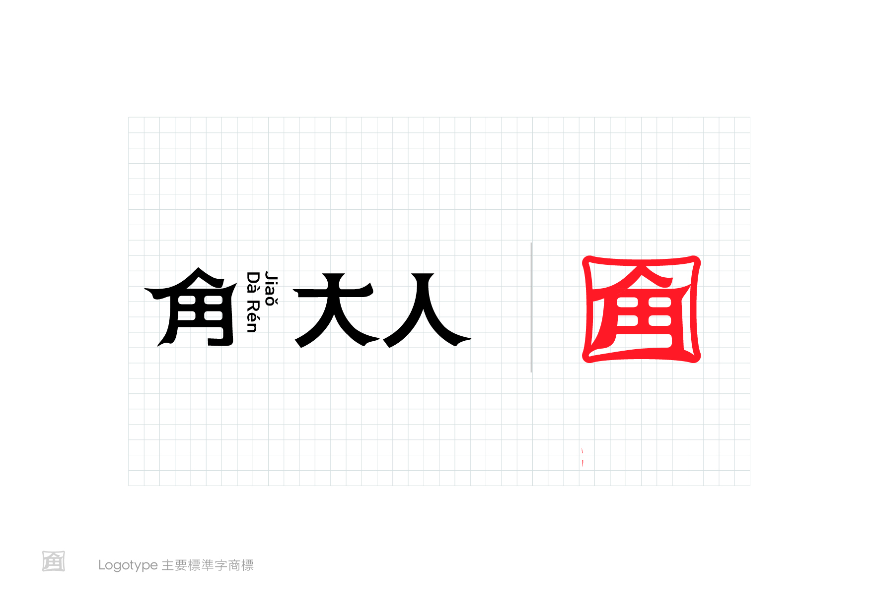
We created Jiao Da Ren (角大人)—a name inspired by the pronunciation of jiao (dumpling), expressing both craftsmanship and character. The tagline "More than flavor. Full of character." reinforces the belief that great brands are defined not only by what they make, but by how they make it.
Identity
The identity combines a contemporary Chinese logotype with a custom seal inspired by traditional Chinese stamps. A restrained palette of red, black, and white creates a timeless visual system that extends naturally across every customer touchpoint.
Packaging
The packaging was designed to maximize product visibility while strengthening shelf recognition.
A transparent pouch reveals the dumplings directly, allowing the product to communicate freshness and quality. Bold red panels, generous white space, and a simplified information hierarchy create a distinctive retail presence while reinforcing the brand's modern identity.
Spatial Design
The space reinterprets the traditional dumpling shop through a contemporary architectural language.
Stainless steel, exposed metal details, and clean geometric forms establish a minimalist environment, while retro vacuum-formed signage preserves the familiarity of Taiwanese street culture. The contrast between industrial materials and nostalgic elements creates a dining experience that feels both modern and authentic.
Project Statement
From naming and identity to packaging and space, every touchpoint was designed to transform a neighborhood dumpling shop into a contemporary brand experience.
RECENT PROJECTS