

Category
Branding
Client
The Sprawl
Creative
Ted
Designer
Mungyu+Ted
The SPRAWL
25 FEB 2024
THE SPRAWL
CASE STUDY
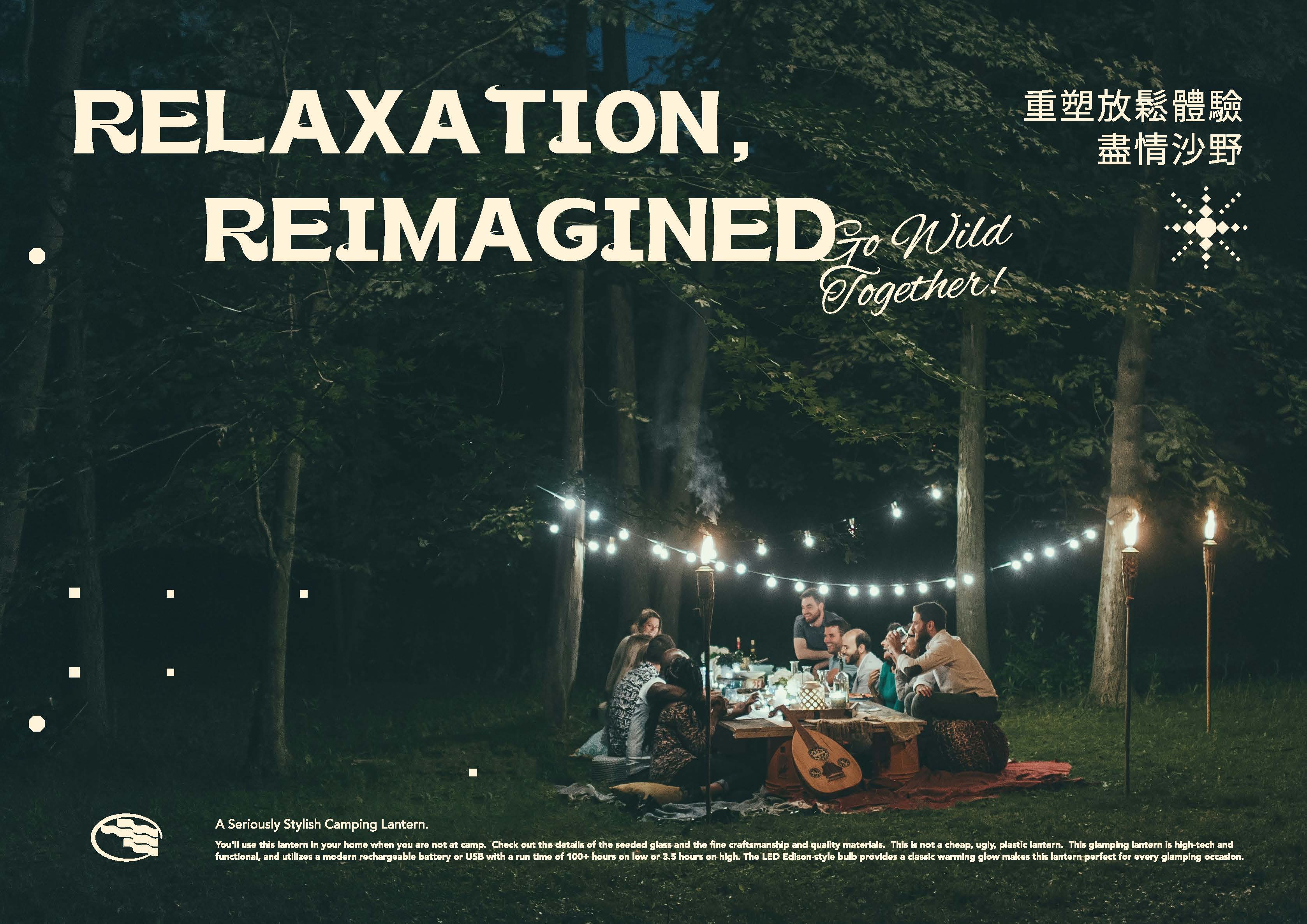
The Sprawl was created to redefine how people reconnect with nature in contemporary life. More than an outdoor brand, it encourages a slower rhythm where relaxation, exploration, and everyday adventure naturally coexist.
The identity is inspired by the flowing contours of sand dunes, mountain ridges, and wind-shaped landscapes. Abstract wave forms become a flexible visual language, symbolizing movement, freedom, and the ever-changing relationship between people and the outdoors. Rather than illustrating nature directly, the system captures its rhythm through simple geometric forms.
This philosophy extends across every brand touchpoint. A restrained palette of forest green, warm sand, charcoal, and vibrant orange reflects changing landscapes from daylight to campfire, while adaptable graphic compositions create a visual system capable of evolving across products, publications, environmental graphics, and merchandise.
From identity and print to environmental graphics and branded objects, every element was designed around one shared belief—Relaxation, Reimagined. The Sprawl transforms outdoor experiences into a contemporary lifestyle where nature is not a destination, but part of everyday living.
RECENT PROJECTS