Branding+Packaging Design
Poran








07 AUG 2025
PORAN
Brand Strategy | Visual Identity | Packaging Design
CASE STUDY
PORAN is a premium skincare brand inspired by the harmony between advanced science and the restorative power of nature. The challenge was to create a contemporary identity that expresses scientific precision without the coldness often associated with clinical skincare, while conveying purity, trust, and timeless elegance. The brand philosophy emphasizes restoring what is essential through restraint, clarity, and respect for nature.
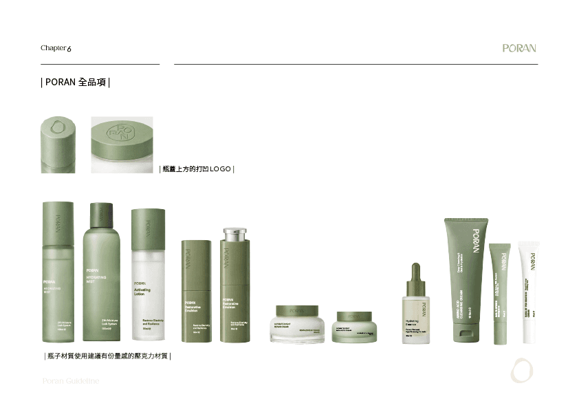
The visual identity translates this philosophy into a refined design system through organic forms, precise geometry, and a muted botanical color palette. Custom typography, tactile packaging, and premium material finishes were carefully integrated to create a calm, sensory experience that reflects the balance between laboratory innovation and natural simplicity.
Designed as a scalable brand system, the project extends consistently across identity, packaging, communication, and product applications, establishing PORAN as a contemporary skincare brand defined by quiet confidence, precision, and authenticity.
案例研究
PORAN 是一個以科學精準與自然修復為核心理念的高端保養品牌。本案的核心挑戰,在於跳脫傳統醫美品牌冷冽且過度科技化的印象,建立一套兼具純淨、信任與當代美學的品牌識別系統,讓品牌在展現科研專業的同時,也傳遞自然與肌膚共生的價值。
品牌視覺以有機流動線條與幾何秩序為設計核心,結合低飽和植萃色彩、精緻字體與具有觸感層次的包裝材質,將「Precision through Nature」的品牌精神轉化為一致且具有辨識度的設計語言,呈現科學與自然平衡共存的品牌體驗。
整體品牌系統完整延伸至品牌識別、包裝設計、產品系列及品牌溝通等接觸點,建立兼具一致性、延展性與長期品牌價值的視覺體驗,使 PORAN 成為融合科學精準與自然美學的現代保養品牌。